The 614cast
Today’s tl;dr
☀️ Sunny, high in the lower 80s.

Forecast highlights
🌧️ Rain? What’s that?
How much rain can we expect over the next week?

Yeah no, that’s basically the long and short of it. Here’s what the National Blend of Models is spitting out.
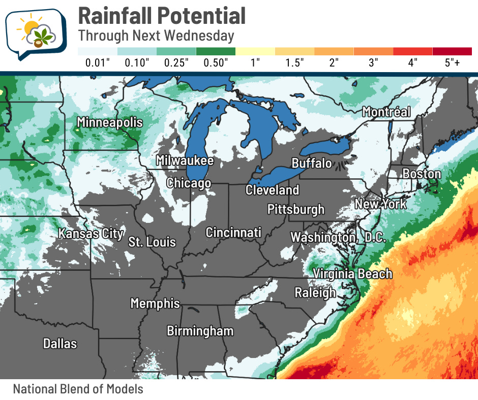
The preponderance of forecast guidance also has little to nothing through at least the middle of next week. While that could change, I don’t see anything promising at this point.
Fall can certainly be a dry time of year. 15 Septembers on record had less than an inch of rain, and that’s happened 24 times in October!
📊 Today’s almanac
Normal low/high: 59 / 80
Record low/high: 41 (1924) / 96 (1983)
Sunrise/set: 7:08 a.m. / 7:48 p.m.
📖 Weather Word(s) Wednesday
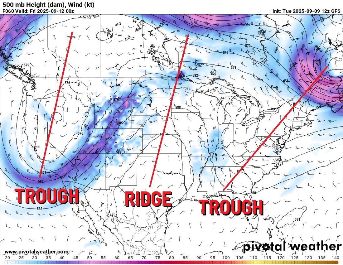
I’ve mentioned ridges and troughs in this newsletter with brief explanations, but thought I’d go into them a little more today.
One of the many tricky things about visualizing the atmosphere is that it’s three-dimensional, but we’re pretty much stuck showing things on 2D maps.
In the past, I’ve showed maps of ridges and troughs and boiled it down to describing ridges as areas where the air arcs northward, while troughs have air dipping southward.
But why do they do that? Forecasters look at data not at certain altitudes, but at certain pressure levels. For example, halfway up the atmosphere is 500 millibars, because standard pressure at sea level is 1013.2 millibars.
The lines on the map above are lines of equal height, similar to a topographical map showing hills and valleys with lines of equal elevation. I’ll come back to that…
The density of air changes with temperature. Cooler air is more dense, while warmer air is less dense. That means that pressure levels are lower in altitude (thinner depth) when the temperature in that region is cooler, and pressure levels are higher (thicker depth) when the temperature is warmer.
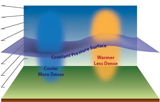
Now imagine drawing lines of equal height on the purple “film” in the above image. You’d have a weather map similar to the one I posted above! We see an north-south axis of a ridge or a trough on a weather map because the air is blobbing thicker or thinner.
Here’s the map again. Now imagine a third dimension in which the air is coming out of your screen toward or away from your eyes.

In the center of the trough, the air is closest to your screen… then moving east toward the ridge, it rises away from your screen toward your eyes… then sinks back downward toward your screen as it moves east toward the Appalachians.
When you think of it in 3D — again, like a topographical map — the north-south ups-and-downs on a flat map make more sense in the context of an atmosphere that is very much not flat.
If you care to read more, check out this link and this link.
🌭 For the weather weenies
-
Lights out: How Trump’s war on climate science is weakening the U.S. (Bloomberg)
-
Over 120,000 evacuated from central Pakistan as floods leave survivors in scorching heat (Associated Press)
-
About half of Americans understand that global warming is increasing homeowners insurance costs (Yale Program on Climate Change Communication)